Web design is a crucial aspect of any online business. It’s the first impression users get when they visit your site, and it plays a significant role in determining whether they’ll stay or leave (no pressure, right?).
Many designers focus on aesthetics and popular trends, but some essential rules are often overlooked.
In this article, we’ll discuss five underrated web design and UX principles that can make a huge difference in your website’s efficiency.
Optimal Line Length for Readability
One of the rules that gets most often overlooked is the importance of an optimal line length. An optimal line length makes it easier for users to read and absorb information, leading to a better overall experience.
According to the Baymard Institute, the optimal line length on the web is between 50 and 75 characters per line.
Some great examples to follow are the New York Times or Washington Post. Their articles keep a line length of about 65 to 70 characters per line on average. While reading them, you’ll definitely notice how easy and comfortable they are to read.

When creating your website, do not allow your text to span the whole screen. Aim for a compact line length to ensure that your content is easily digestible and visually appealing.
Quick fix: Increase your font size (16–20px is best) and reduce your article’s width (ideally 600–850px on desktop).
Want to make your blog more readable? Ask about our Static Web Design solutions.
Eye-catching Call-to-Actions (CTAs)
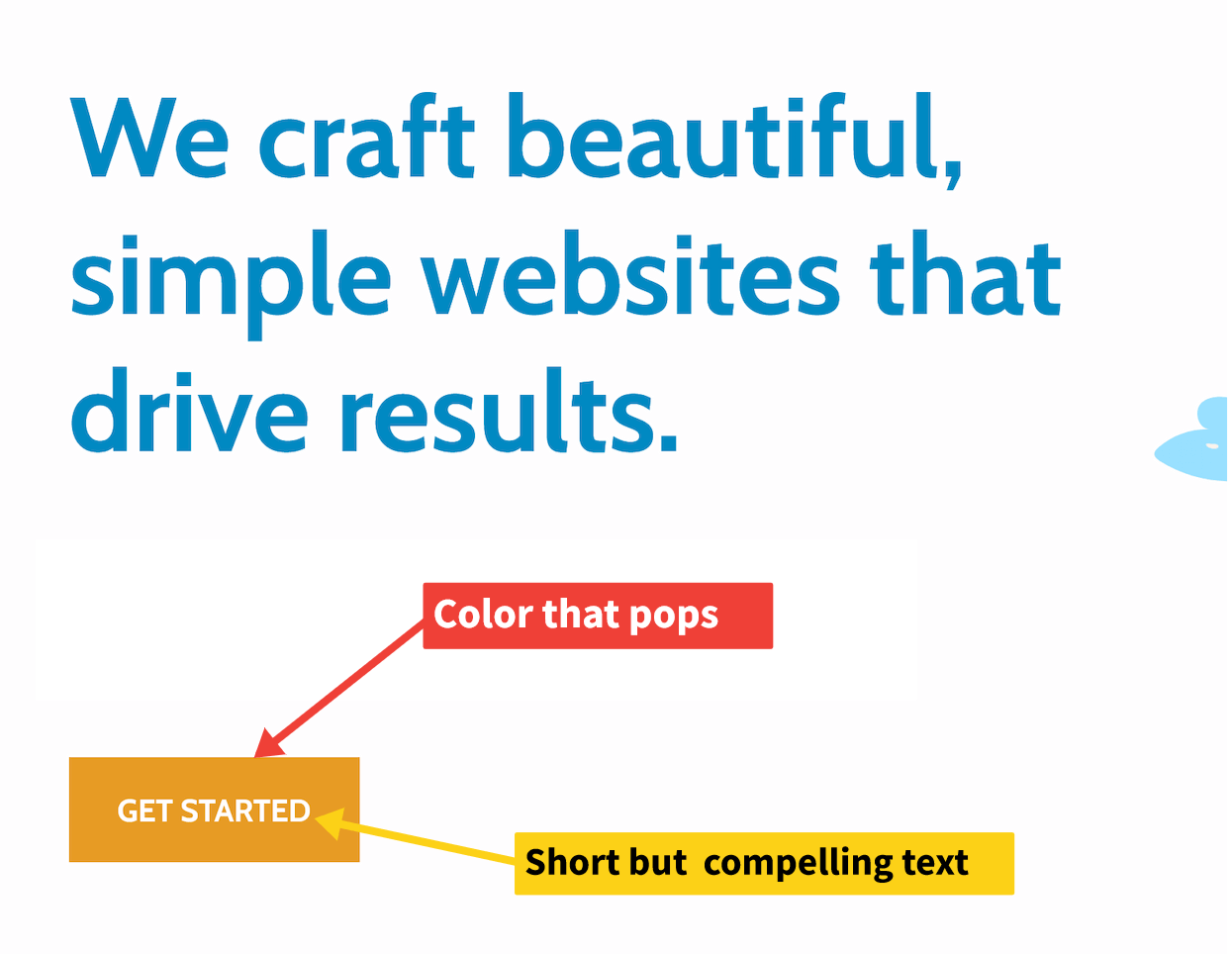
Call-to-actions (CTAs) are essential to guide users toward a desired action (contacting you, making a purchase, or subscribing).
CTAs often get lost in the design when they use the same color scheme as other links. Make sure your CTAs stand out with:
- Contrasting colors
- Bold fonts
- Clear, action-driven text
A well-designed CTA can significantly improve conversion rates and user engagement.
Accessibility Features
Accessibility is a vital aspect of web design that is frequently overlooked.
A truly inclusive website should cater to all users, regardless of their abilities or disabilities. Two key areas:
Keyboard Navigation
All links, buttons, and forms should be accessible by keyboard only—no mouse needed.
Color Contrast
Use high contrast colors for text and backgrounds, and test your design with online accessibility tools. This benefits everyone, not just those with vision impairments.
Learn more: Ultimate Guide to ADA Compliance or our accessibility services.
Site Speed
A slow website can be a deal-breaker for many users and will hurt your search ranking.
Key ways to speed up your site:
- Use quality, fast hosting
- Compress images (WebP or Avif)
- Minify and combine CSS/JS
- Use a CDN (e.g., Cloudflare)
- Implement browser caching
For most small businesses, a static website is the easiest way to get lightning-fast performance.
See also: 9 Steps to Improve Core Web Vitals
Mobile Responsiveness
No one should have to zoom or scroll sideways on your site! Always design mobile-first, with fluid grids and flexible images.
Test on various devices and browsers to ensure a seamless mobile experience.
Conclusion
The best web design isn’t about chasing the latest trends—it’s about usability, accessibility, and speed. By following these five rules, you’ll build a site that performs, converts, and works for every user.
Ready to upgrade your web presence? Contact Kalyxo for expert help with web design, accessibility, and performance.
FAQs
Why does line length matter in web design?
Optimal line length improves readability and makes your content easier to digest. Ideally, aim for 50–75 characters per line on desktop for the best user experience.
How can I make my CTAs more effective?
Use contrasting colors, bold text, and clear, action-oriented language. Place CTAs where they’re easy to find and test them on both desktop and mobile.
What are the most overlooked accessibility features?
Keyboard navigation, high color contrast, alt text for images, and clear, semantic HTML structure are often forgotten but make a huge difference for users with disabilities.
How does site speed impact my website?
A slow website drives visitors away and hurts your Google rankings. Optimize images, use fast hosting, and implement caching to speed things up.
Why is mobile responsiveness critical?
Most web traffic comes from mobile devices. A mobile-responsive design ensures your site looks great and functions smoothly on all screen sizes, improving engagement and SEO.
